Tatler Media pack
Introduction
1) Look at the Tatler Media Pack. Go to page 2: how does the editor introduce the magazine?
the magazine is introduced as bold, and it appeals to richer demographic because of the vocabulary used by the editor is advanced and connotes that the audience will be highly educated and able to understand and interpret higher level vocabulary
2) Now go to page 4 of the Media Pack. Focus on the print magazine. List the key demographic details: age, gender %, ABC1 % (social class), HHI (Household Income), % of those living in London and the South East. What do these demographic details suggest about the average Tatler reader?
The average age is 41, the gender appealed to the most is females with 73%, the ABC1 % is 83%, the average HHI is £261,572 and 70% of readers live in south east and London.
This information tells us that the average reader is a wealthy middle-upper class woman
3) Look at page 6. What do Tatler readers think about fashion? How much do they spend?
Tatler readers think fashion is an important staple to be involved in as they say 'i often buy fashion products after seeing things advertised in magazines' this also links to how they take inspiration and ideas from tatler. As a whole, 96% of them collectively have spent £843 million on fashion the past year and 93% of readers own designer fashion
4) Go to page 10. What are the special editions of Tatler that run throughout the year? What does this suggest about the pyschographic groups who read Tatler?
The special editions that run in the year are a Travel guide, Weddings Guide, a Beauty & Cosmetic Surgery Guide, Spa Guide and a Watches & Jewellery Guide. These all link to how wealthy and how much money the readers have to spend on luxuries like those.
Media language
1) What different examples of typography can you find on the cover of Tatler? What are the connotations of the serif and sans serif fonts?
there are examples of sans serif and serif, sans serif gives a more modern look whereas serif is more traditional and authoritative
2) How do the cover lines appeal to the Tatler target audience?
because they mention celebrities names who are famous among young people which will give them some interest and relatability to make them interested in buying the magazine
3) What are the connotations of the Tatler colour scheme on this particular front cover?
the colour scheme is earthy and natural as it includes: greens, browns, dark golds and cream colours. these colours suggest youth and abundance which can appeal to younger audiences.
4) How is the central image designed to create interest in the magazine? Find three reasons for your answer. (E.g. Mise-en-scene such as props, costume and make-up, body position, facial expression)
its used to create interest by using an excessive amount of jewellery and makeup and this can connote to them trying to attract and interest young females who will have a passion in makeup and accessories. the eye makeup is quite fierce and her facial expression is very determined and independent.
Representations
1) What different groups of people are represented on the cover? (E.g. men/women/white people etc. Look at the image and text/cover lines to help here)
the front cover stars a young white female, maybe in her early 20's, the cover lines feature the name of James Corden who's a white male British tv host and presenter and in the cover lines it mentions his 'aristocrat buddies' linking and relating the magazine to a upper class audience.
2) What do the cover lines suggest about the lifestyle of rich people in the UK?
the cover lines suggest the middle/higher classes are interested in things like jewellery and aristocracy
3) Are there any stereotypes being reinforced or subverted? How? Why?
A stereotype that's being reinforced is females being associated with makeup and jewellery as the model is wearing an excessive amount of eye makeup and she's wearing necklaces and pearls. Whereas something being subverted could be that there is no representation for the working / lower classes of the UK, therefore excluding them from the magazine, since nothing in them will apply to them.
4) What would be the preferred and oppositional readings to this cover of Tatler?
the preferred reading of this cover is that you should buy the magazine if you are fit into a wealthy higher class demographic who's interested in fashion. This is because a majority of the cover lines talk about fashion and partying, which is what a lot of richer people are stereotypically known for doing . the producers make the target audience think that the magazine is modern and could apply to their lives which makes them able to relate to it and increases the chance of them buying it. The colour scheme of this cover could make the reader feel as if they are sophisticated since pink; black and white are colours that are associated with elegance and beauty and make the cover seem more advanced in design and layout making it sophisticated.
On the other hand, the oppositional reading of this cover would be that Tatler is a very niche magazine, and could deter more people from reading it. This is because only one group of people is targeted in this cover (richer upper class people) and that may make people who aren't rich feel excluded, making them less likely to buy the magazine. This makes the other audiences unable to relate to the magazine which will not intrigue them into buying it. Also, the central image is of a whit woman wearing makeup and the cover line that refers to the image only talks about her appearance which can make females feel objectified and seen as just a pretty face, since they are portrayed as unable to do anything but looking good. Also the cover lines mention a celebrities 'aristocrat friends' which enforces the point of a wider audience not being able to relate to it.
Social and cultural context
wom
1) What aspects of British life or people are NOT reflected in Tatler? (Watch the clip above again if you need help with this - the clue is in the title 'Posh People')
Tatler does not reflect the struggles of job difficulties that everyday people go through also money issues or lower class life. In a majority of British lives, money is not inherited but instead worked for, unlike Tatler's target audience who could have an inherited aristocracy or simply from a wealthy upper class family. Also, Tatler never touches on public schools or and similar public services instead they focus on luxuries only a richer audience could easily afford.
2) Tatler runs special issues on holidays, spa breaks, cosmetic surgery, watches and jewellery and private schools. What does this suggest about the magazine's representation of life in Britain?
tatler represents british life as luxurious and suggests readers don't go to work or don't need to because they have inherited wealth and suggests the audience has time to go on holidays, buy expensive luxury goods and has advantages to go to private schools. This can connote to how the target audience is of a richer society and class because they are able to do those things which a normal working class british citizen would not be able to do comfortably.
3) What audience groups might be offended or insulted by the front cover of Tatler April 2017?
the cover could insult women for being seen as feminine and only interested in the fashion side of the world and also could offend working/lower classes because they are not represented at all and this makes it a niche magazine because there is not a wide range of a target audience.
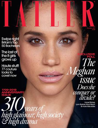
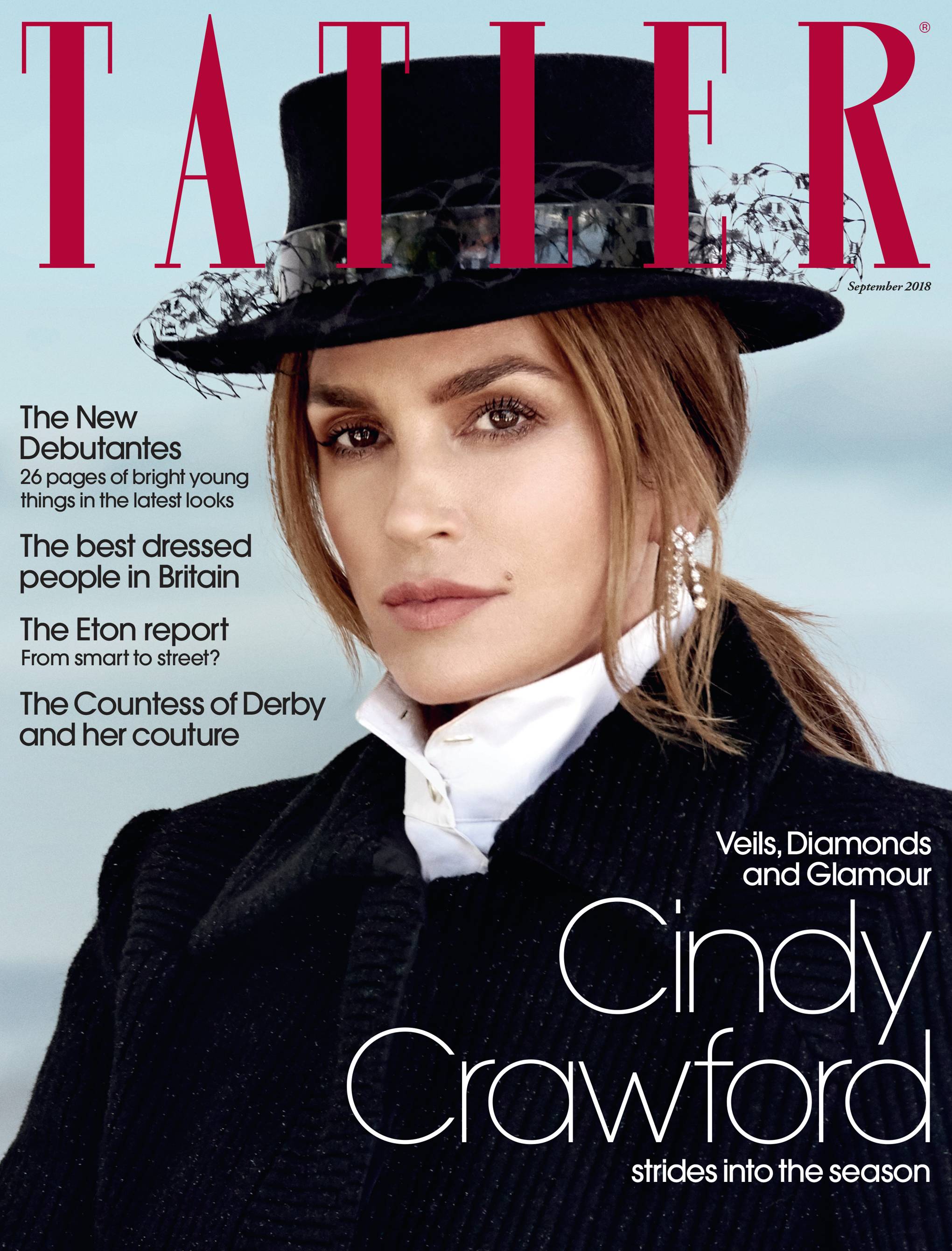
4) Find three other front covers for Tatler. What issues or problems are regularly featured in Tatler?
all 3 feature young women who live a rich life, Meghan Markle who is considered royalty and Sofia Richie and Cindy Crawford who are both considered influential supermodels who are extremely passionate in fashion and beauty. All 3 cover lines all mention relationships, celebrities or royalty, money and wealth, parties and beauty/fashion.

On the other hand, the oppositional reading of this cover would be that Tatler is a very niche magazine, and could deter more people from reading it. This is because only one group of people is targeted in this cover (richer upper class people) and that may make people who aren't rich feel excluded, making them less likely to buy the magazine. This makes the other audiences unable to relate to the magazine which will not intrigue them into buying it. Also, the central image is of a whit woman wearing makeup and the cover line that refers to the image only talks about her appearance which can make females feel objectified and seen as just a pretty face, since they are portrayed as unable to do anything but looking good. Also the cover lines mention a celebrities 'aristocrat friends' which enforces the point of a wider audience not being able to relate to it.
Social and cultural context
wom
1) What aspects of British life or people are NOT reflected in Tatler? (Watch the clip above again if you need help with this - the clue is in the title 'Posh People')
Tatler does not reflect the struggles of job difficulties that everyday people go through also money issues or lower class life. In a majority of British lives, money is not inherited but instead worked for, unlike Tatler's target audience who could have an inherited aristocracy or simply from a wealthy upper class family. Also, Tatler never touches on public schools or and similar public services instead they focus on luxuries only a richer audience could easily afford.
2) Tatler runs special issues on holidays, spa breaks, cosmetic surgery, watches and jewellery and private schools. What does this suggest about the magazine's representation of life in Britain?
tatler represents british life as luxurious and suggests readers don't go to work or don't need to because they have inherited wealth and suggests the audience has time to go on holidays, buy expensive luxury goods and has advantages to go to private schools. This can connote to how the target audience is of a richer society and class because they are able to do those things which a normal working class british citizen would not be able to do comfortably.
3) What audience groups might be offended or insulted by the front cover of Tatler April 2017?
the cover could insult women for being seen as feminine and only interested in the fashion side of the world and also could offend working/lower classes because they are not represented at all and this makes it a niche magazine because there is not a wide range of a target audience.
4) Find three other front covers for Tatler. What issues or problems are regularly featured in Tatler?
all 3 feature young women who live a rich life, Meghan Markle who is considered royalty and Sofia Richie and Cindy Crawford who are both considered influential supermodels who are extremely passionate in fashion and beauty. All 3 cover lines all mention relationships, celebrities or royalty, money and wealth, parties and beauty/fashion.
Comments
Post a Comment